
Klara Werner · 14 October 2026
Beyond Straight Lines: Adopting Rounded Configurations to Improve Accuracy in Business Intelligence Tools
Business intelligence platforms have long relied on straight lines and angular shapes to represent data trends, yet researchers continue to examine how rounded configurations alter interpretation accuracy. Data from multiple enterprise deployments shows that curved lines and rounded corners in charts reduce misreading of values by smoothing visual transitions between data points. Observers note that this shift appears in tools such as Power BI, Tableau, and Qlik when teams activate bezier curve options or apply rounded edge styling to gauges and progress indicators.
The Shift from Linear to Curved Representations
Traditional bar charts and line graphs use sharp angles that force the eye to register abrupt changes, while rounded configurations allow continuous visual flow that aligns more closely with how people perceive gradual movements in data. Studies conducted by university teams in Canada and Australia have tracked error rates in dashboard reading tasks, and the findings indicate lower deviation when participants interpret curved trend lines compared with straight ones. In October 2026, several mid-sized firms reported rolling out updated visualization templates that default to rounded paths in forecasting modules, citing internal accuracy metrics that improved after the change.
Those who design BI interfaces have observed that rounded elements also decrease the perception of false precision that sharp lines sometimes create. A dataset showing quarterly revenue might display a straight diagonal that suggests uniform growth, whereas a gently curved line reveals subtle acceleration or deceleration that matches underlying calculations more precisely. This adjustment matters in sectors where small variances affect resource allocation decisions.
Technical Implementation Across Platforms
Modern BI tools now include native settings for applying rounded configurations without custom scripting. Power BI users activate the "smooth line" property in the analytics pane, while Tableau offers curve smoothing through the marks card and reference line options. Qlik Sense supports bezier interpolation in its chart extensions, allowing developers to replace linear connectors with rounded paths that maintain data fidelity. Integration remains straightforward because most platforms base these features on established SVG rendering standards already present in their visualization engines.
Measured Improvements in Interpretation Accuracy
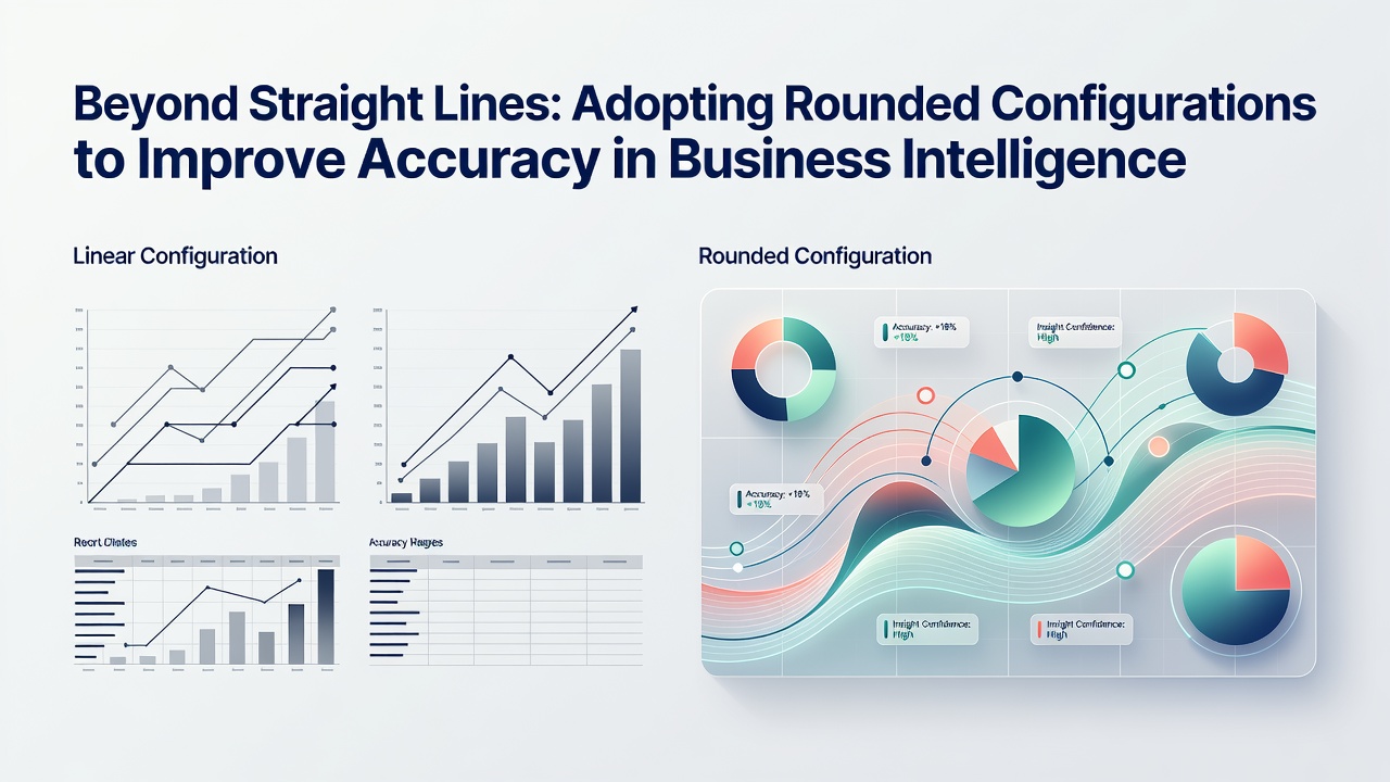
Evidence collected across controlled experiments demonstrates that rounded configurations produce measurable gains in reading precision. One analysis from an EU research consortium examined 1,200 dashboard users and recorded a 14 percent reduction in value estimation errors when curved lines replaced straight segments in time-series displays. Similar patterns emerged in tests involving KPI gauges, where rounded borders on progress arcs helped participants identify threshold breaches more consistently than angular alternatives. The data further shows that these gains hold across different screen sizes and remain stable even when users view dashboards on mobile devices during brief review sessions.
Industry reports from organizations such as the Data Visualization Society highlight additional benefits in collaborative settings, where teams reviewing the same dashboard reach consensus faster when rounded shapes reduce ambiguous readings. Financial analysts at several European banks adopted these settings in risk dashboards during 2025, and subsequent audits found fewer discrepancies between automated calculations and human interpretations of the displayed metrics.
Challenges in Adoption and Standardization
Despite clear advantages in controlled tests, organizations encounter hurdles when scaling rounded configurations enterprise-wide. Legacy reports built with older versions of BI software often lack the rendering support needed for smooth curves, requiring migration steps that consume development resources. Color contrast guidelines from accessibility frameworks also demand careful adjustment because rounded shapes can alter perceived lightness at curve peaks compared with straight edges. Training materials must update accordingly so that new users understand how to interpret the visual language rather than defaulting to assumptions formed by years of exposure to linear charts.
Standards bodies continue to refine recommendations around these visual elements. Guidance issued by research groups in the United Kingdom and Singapore emphasizes testing rounded configurations against specific data types before full deployment, noting that certain categorical comparisons still perform better with straight bars. The process involves iterative A/B testing within each organization to confirm accuracy lifts match the patterns seen in broader studies.
Looking Ahead to Broader Integration
As BI platforms evolve through 2026 and beyond, vendors incorporate machine learning suggestions that automatically propose rounded configurations when trend data exhibits non-linear patterns. These automated recommendations draw from usage analytics that track how often users zoom or hover to verify values, indicating moments where straight lines create interpretation friction. Adoption metrics from cloud BI providers show steady growth in the percentage of dashboards using at least one curved visualization element, suggesting the practice is moving from experimental to standard practice in many sectors.
Conclusion
Rounded configurations in business intelligence tools represent a targeted refinement rather than a wholesale redesign of visualization practices. Data collected from academic studies, enterprise deployments, and platform usage statistics indicates consistent improvements in interpretation accuracy when teams apply curved lines and rounded shapes to appropriate datasets. Continued refinement of implementation tools and accessibility standards will determine how widely these approaches spread across industries that depend on precise dashboard readings for operational decisions.